
Data visualization is crucial for translating complex data sets into an understandable and actionable format. Without effective visualization, businesses risk missing out on valuable insights that could drive decision-making and competitive advantage. In today’s data-driven world, selecting the right data visualization tool can make a significant difference in how data is perceived and utilized.
Understanding the Best Tools for Data Visualization
Data visualization tools are designed to enable users to easily create interactive and visually compelling representations of data. These tools help transform raw data into graphical formats such as charts, graphs, and maps, thus making complex information more accessible and comprehensible for users at all levels of data literacy. Below, we explore some of the most reliable data visualization tools available in the market today.
Tableau: Tableau remains one of the most respected names in data visualization for good reason. It provides robust features for creating dynamic dashboards and interactive reports. Professionals across various industries rely on Tableau for its ease of use, powerful analytics, and wide range of visualization capabilities. Additionally, its ability to handle large datasets and provide real-time data updates makes Tableau a popular choice for businesses looking to stay ahead in data analytics.
Power BI: Developed by Microsoft, Power BI is another highly acclaimed tool for data visualization. What sets it apart is its seamless integration with other Microsoft products, such as Excel, enhancing its utility for those already within the Microsoft ecosystem. Power BI offers advanced data analytics, allowing users to drill down into data, offering a more profound understanding of the information presented. Its affordability makes it accessible for a wide range of businesses, from small startups to large enterprises.
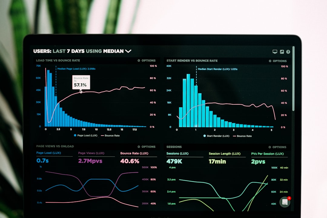
Looker: Acquired by Google Cloud, Looker offers a modern approach to data visualization that emphasizes on real-time analytics and big data compatibility. What distinguishes Looker is its ability to allow users to create custom metrics and run deep analytical queries without the need for complex coding knowledge. Looker is specifically designed for data teams who need to operationalize data quickly and deliver results to stakeholders in an automated fashion.
D3.js: Unlike other tools, D3.js is more of a library rather than a standalone application and provides incredible flexibility for data professionals. Its strength lies in its ability to produce highly customized and intricate data visualizations. With D3.js, developers can fashion bespoke data presentations tailored to specific needs, albeit requiring a greater level of technical expertise and coding ability.
The Importance of Choosing the Right Tool
Selecting the correct data visualization tool depends heavily on the specific needs and inherent data challenges of your organization. Each tool offers its unique strengths, and businesses should evaluate factors such as ease of use, integration capabilities, real-time analysis, customization options, and cost before making a decision.
For instance, if a company needs comprehensive integrations with existing systems and smooth user interface, Power BI could be the best option. For data teams that prioritize real-time capabilities and custom metrics, Looker may be more suitable. Meanwhile, organizations that require a deeper level of customization might opt for D3.js to leverage its robust library features.
Significant Advances in Data Visualization Technologies
Today, advancements in machine learning and artificial intelligence are increasingly integrated into data visualization tools, enabling more predictive analytics and automating initial phases of data preparation. This seamless integration helps businesses obtain insights faster and respond to market changes more swiftly, fortifying their strategies with data-backed insights. With these cutting-edge technologies, data visualization tools aren’t merely about presentation anymore, but about driving future-ready business strategies.
Final Thoughts
In conclusion, choosing the right data visualization tool is pivotal for effective data management and insight generation. With the multitude of tools available in the market, organizations must prioritize identifying the solutions that align with their operational goals and data analytics strategies. As data continues to shape the competitive landscape, the right visualization tool not only simplifies data consumption but empowers stakeholders to progress with confidence and clarity in an ever-evolving digital economy.
IT Trend
data visualization


Leave a Reply